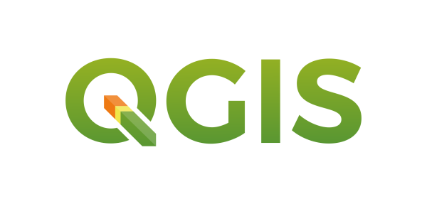
Adoption of a new logo for QGIS 3.0
If you have been following this blog and the QGIS community discussions, you will know that 2017 is going to be a big year in the history of QGIS since we are planning the release of QGIS 3.0. One of the requests we had during our Girona Hackfest held earlier this year was to come up with a fresher logo for QGIS. Some of you may remember that we had an abortive attempt at coming up with a new logo a couple of years ago. We found that process quite difficult to manage since we tried to do it in a completely open way and there were so many differing opinions, varying tastes and so on that the whole process reached an impasse and we decided to shelve the idea for time being. With that history in mind we decided to approach the logo updating process for QGIS 3.0 differently this time around and use a professional designer to come up with a design and then provide the QGIS Voting Members with a simple, binary YES/NO choice as to whether they accept the new logo or not.
Our current logo is a revised, polished version of the original QGIS logo:

The first (left) and second (right) generations of the QGIS logo.
While we’ve all grown to love the yellow ‘Q’ with the green arrow (no comic pun intended), the design choices, such as glow effect and drop shadows look dated. Probably the biggest problem with the current logo is that there is also no consistent logo variant that spells out ‘QGIS’ without duplicating the Q. For the logo refresh we came up with a list of requirements for the new design:
- It should look more modern than the current logo
- Avoid any clichés with compass, north arrow and avoid image elements
- The logo has to work as a :
- Large and small application icon (on computer desktop, menus, …)
- On big posters & banners
- On stickers to place on laptops etc
- On t-shirts and other promotional materials
- On letterheads etc.
- Should work well in monochrome (or have a monochrome variant)
- Square and rectangular variants should be possible
- If possible, keep element(s) from the current design. It is important for the new logo to try to retain some of these elements (Q, arrow, colors, …) so people can still recognize the QGIS brand.
- There should be a variant that includes the whole word ‘QGIS’ or ‘QGIS.ORG’. * Currently when we place the logo next to the word QGIS we get a redundant QQGIS or we need to carefully match fonts to make it work
- As an application icon, it must work on light or dark backgrounds without modification
- As a general logo, it should have accepted variants that work on light or dark backgrounds
- Font has to be open source
- We should also consider how the logo and accent colours can be used in different contexts, e.g. stationery, stickers, …
- We went through many iterations, reducing the number of options on each iterations as we applied the above criteria to the candidates. We would like to now present our final candidate (monochrome icon, colour icon, full logo):
![]()


While retaining the traditional yellow and green, the addition of a new third colour is a nice play on version 3.0. In addition, the old arrow is now a more natural part of the Q and there is a version designed to spell out QGIS.
We are asking the QGIS Voting Members to vote in order to affirm or reject this new logo. If it is approved we will start the process of rebranding QGIS for version 3.0. If not we will go back to the drawing board and repeat the process until we come up with a logo the QGIS Voting Members are happy with …
Poll Created Tue 13 Dec 2016 9:15PM
Do you accept the proposed logo to become the new official QGIS logo? Closed Tue 20 Dec 2016 9:01PM

Results
| Results | Option | % of points | Voters | |
|---|---|---|---|---|
|
|
Agree | 100.0% | 24 |
|
| Abstain | 0.0% | 0 | ||
| Disagree | 0.0% | 0 | ||
| Block | 0.0% | 0 | ||
| Undecided | 0% | 8 |
|
24 of 32 people have participated (75%)
Larry Shaffer
 Tue 13 Dec 2016 9:42PM

Not sure if I should switch to abstain, given I helped on the logo group.
Nathan Woodrow
 Tue 13 Dec 2016 10:37PM

Nice work. I like it a lot.
Matthias Kuhn
 Wed 14 Dec 2016 7:10AM

Wow, this looks great!
yjacolin
 Wed 14 Dec 2016 9:30AM

really nice!
Vincent Picavet
 Wed 14 Dec 2016 5:27PM

I think gradients could be a bit better ( or flat version to go along "material" style trend ?), but it is already much much better, so go for it !
Werner Macho
 Wed 14 Dec 2016 9:47PM

nice looking and modern - the right start for 3.0
Alexander Bruy
 Thu 15 Dec 2016 8:12AM

I like, great work
QGISBrasil
 Fri 16 Dec 2016 1:50PM

:smiley: :thumbsup:
Lene Fischer
 Mon 19 Dec 2016 8:22PM

The Logo is nice - But I don´t like to change - users get confused and a lot of explonations to be done... I do know the code :heart: work to change to 3.0 is 1000 times larger!